Unearthing a Better Experience

National Mining Association | Website Redesign

The National Mining Association (NMA) is the trade organization representing the U.S. mining industry, advocating for public policy to allow the country to benefit from America’s natural resources. The site in its previous state suffered from visual overload, dated visuals, and endless unsearchable content. Across the 6-month project, we focused on combating these challenges in order to best serve all of their audiences.
Core Improvements

Beauty reflects innovation

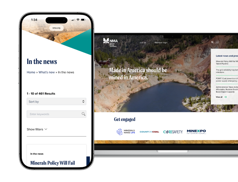
Introduced bold and modern design elements to better reflect the innovation of the industry

A smarter menu

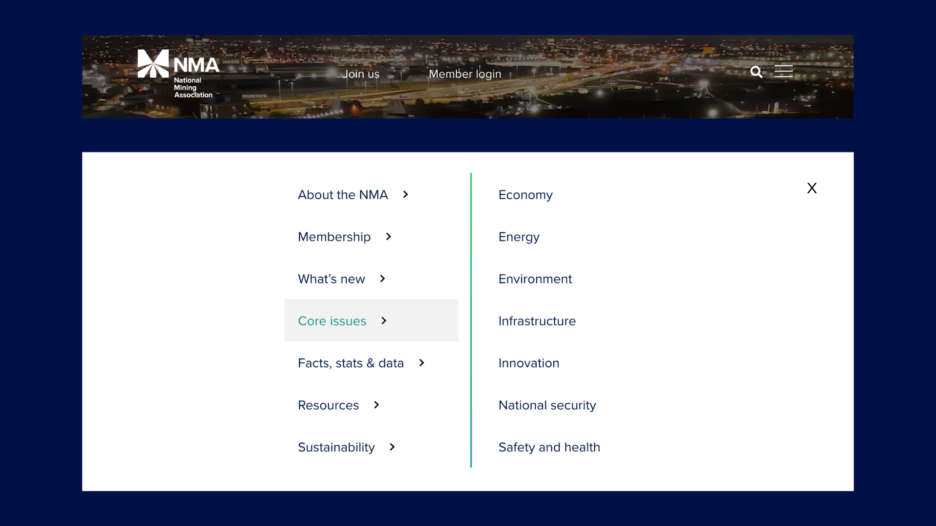
Introduction of a mega-menu to better categorize and increase usability to site pages

Streamlined resources

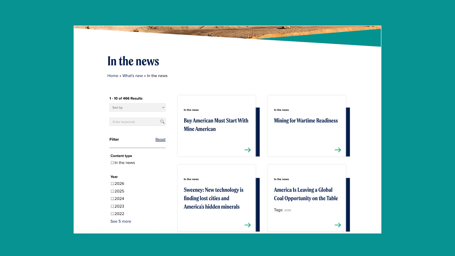
Introducing faceted search and filters across the resource library, as well as reducing posts per page

Site compliance and ease

Upgrading to Gutenberg block editor for easier content management and ensuring site-wide WCAG AA compliance

Beauty reflects innovation

We, along with the NMA team, wanted to create a bolder aesthetic of the site to better reflect the innovation and evolution of the mining industry. We beautified the site by introducing a new typography system and visually appealing UI cards, and played with the angularity of the logo in header & footer elements. To enhance the user experience, we brought in more interactive hover elements and implemented a full-page parallaxing homepage.

A smarter menu

NMA’s existing site navigation had roughly the right set of elements needed for users, but suffered from the steering problem of needing a specific cursor path, making it very difficult for people to actually get to certain pages from the main navigation. First, we limited the sticky navigation to just two main destinations, while creating a mega-menu collapsed as a hamburger menu located in the top right corner. Within this menu, we did a bit of tidying up the list of pages/sub-pages and improved the triangle safe zone for cursors. All of these improvements allow visitors to get to their content quicker, frustration-free.

Streamlined resources

NMA has over a decade of content on the site: information on core issues, news features, press releases, and industry statistics. These posts previously lived on their respective pages as an endless scroll of posts in a masonry grid at the bottom of the page, with the only sorting feature being ‘year’. This caused extreme cognitive overload and no way for a user to search the content for their needs. By implementing faceted search and filters on each resource library and the default page load being limited to 10 posts, users now have a much simpler time navigating to their desired resource with precision.

Credits: This project was done in collaboration with the technology services, developer, and creative teams at Beekeeper Group.