Moving Into Modernity

Physical Activity Alliance | Website Redesign

The Physical Activity Alliance (PAA) is a national coalition dedicated to policy and systemic changes enabling a more fit lifestyle for all. Their website felt cluttered and outdated, making it hard for visitors to navigate to the most important information. Our redesign focused on clarifying multiple structural aspects, improving back-end site health, and giving the site an overall visual refresh.
A Stronger Foundation

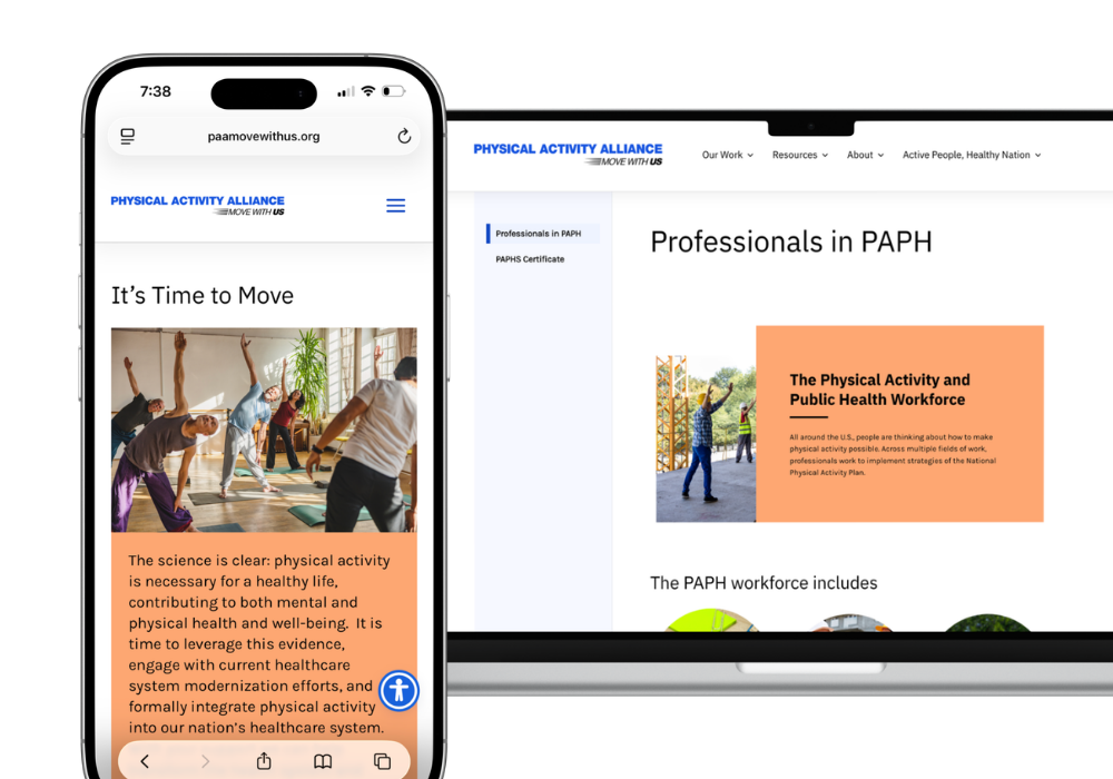
Mobile and desktop screens showing Physical Activity Alliance website with info on moving for health and PAPH workforce.

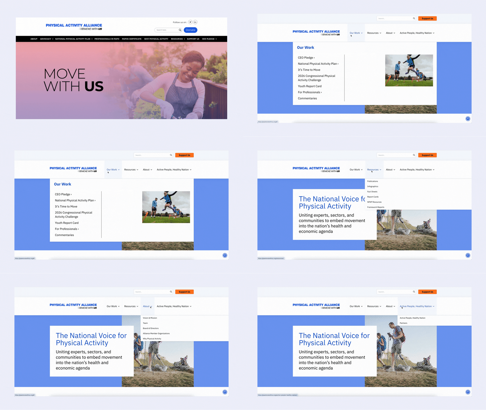
Streamlined navigation

Restructured and reduced menu items to lead users to content in fewer clicks

Resource organization

Introducing faceted search and filters across the resource library

Refreshed modern visuals

Bringing a crisp facelift to enhance credibility

Back-end site health

Improving site speed & ensuring accessibility across the board
Physical Activity Alliance website header with a woman gardening and text Move with Us

Streamlined navigation

PAA’s existing site navigation had too many elements and lacked a clear hierarchy. With our restructuring of the information architecture, pages were more clearly organized in familiar categories, reducing the cognitive load for site visitors to get to the right place, faster.
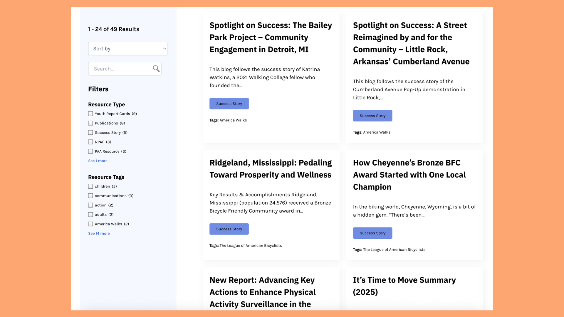
Webpage showing filterable list of blog posts about community projects and success stories.

Resource organization

PAA provides dozens of resources in its library, but they were previously scattered across multiple site pages, with no way to sort through beyond manual scrolling. To prevent content from being buried, we first consolidated all resource types into one expansive library. Additionally, by implementing faceted search and filters, users are now able to narrow their results to their intended topic.
Animated webpage showing sections about physical activity, health, and partner organizations with images and text blocks.

Refreshed feel, same mission

The PAA team was looking for a revitalized aesthetic for their site to provide stronger credibility as an authority figure on this mission. To elevate their site, we introduced brighter tints of their existing brand colors, a new type system, and sourced new stock imagery to fit the energized feel they desired.

Credits: This project was done in collaboration with the technology services team at Beekeeper Group.